LAMBORGHINI HAS A NEW LOGO, AND IT’S… RADICALLY SIMILAR TO THE OLD ONE
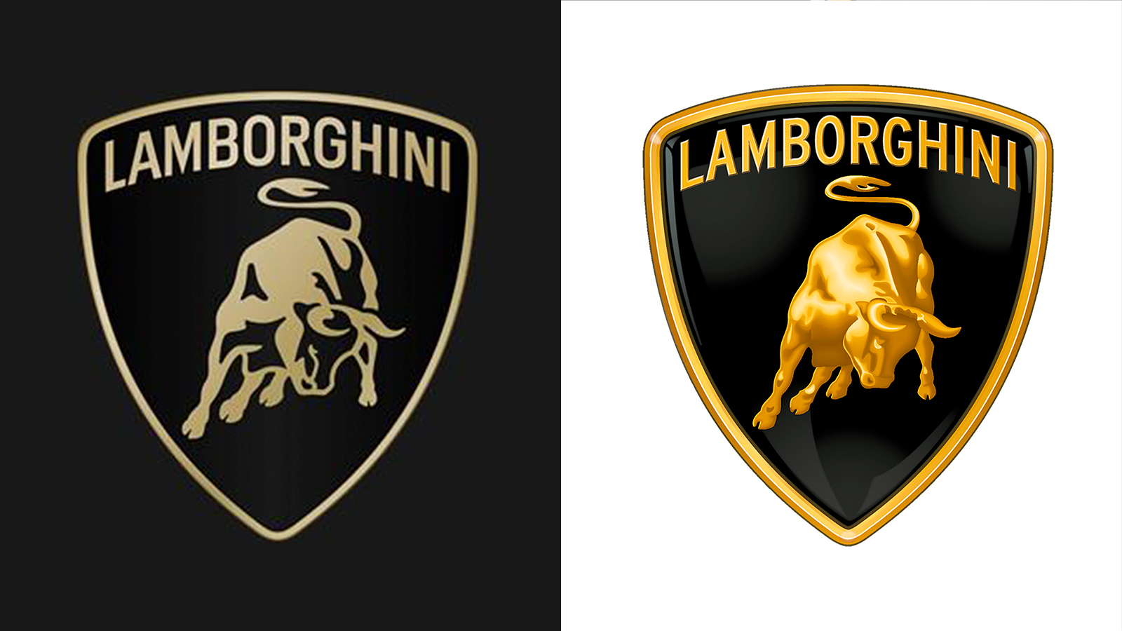
Well what have we got here? Lamborghini has decided that after more than two decades, the time is right to give its logo an update to reflect the needs of the modern world. The result is… this.
According to Lambo, the new identity - which will be applied to all of its cars from now on - better reflects its ‘brave, unexpected and authentic values’, and forms part of its push towards ‘sustainability and decarbonisation’. Nope, us neither.
The new badge is more muted than before and drops the 3D-effect, er, _effect of the old version, while the lettering is now ‘broader’ and forms part of an official brand typeface. What, no Lamborghini Sans?
Lambo also says black and white are now its primary colours once again (a combo not seen since the early 70s), while yellow and gold are now considered ‘accent’ colours. All will become clear in due course, no doubt.
Meanwhile, you’re going to be seeing a lot more of the raging bull on its own (Lamborghini’s social media channels, for example), freed from the shield to give it more ‘prominence’, claims the company.
The origin of the bull isn’t entirely clear: founder Ferruccio Lamborghini was both a Taurus and lover of bullfighting, so those are the two most popular theories in Lambo ‘lore.
Anyway, do we, um, like it? At least Lambo hasn’t jumped on the worst of bandwagons and started splashing LAMBORGHINI in great big chrome letters on the back of its cars…